


PixelLab is a versatile mobile design app for creating text-based graphics, editing images, designing posters, making social media content, and experimenting with typography. Whether you are a beginner or already have experience with mobile graphic design, learning the right PixelLab techniques can help you create cleaner and more professional-looking designs. PixelLab Tutorials: Learn Photo Editing, Typography & Design
You do not need advanced desktop software to start creating attractive graphics. With the right combination of text effects, image editing, typography, layers, colors, shadows, and background design, PixelLab can be used for many everyday creative projects.
In this guide, you will learn the essential PixelLab techniques that can help you improve your photo editing and graphic design skills step by step.
✨ What Is PixelLab?
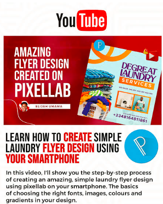
Name
PixelLab Tutorials: Learn Photo Editing, Typography & Design
Date
Catagory
PixelLab is a mobile graphic design and photo editing application focused heavily on text and visual composition. It provides tools for adding and customizing text, importing images, adjusting colors, creating effects, and combining multiple design elements.
The application can be useful for creating:
- 📱 Social media graphics: Design posts, stories, thumbnails, announcements, and promotional images for different platforms.
- 🖼️ Posters: Create posters for events, businesses, schools, communities, and personal projects.
- ✍️ Typography designs: Experiment with fonts, spacing, shadows, outlines, and other text effects.
- 🎨 Photo edits: Combine images with text, overlays, shapes, and color adjustments.
- 🏷️ Logos and branding graphics: Create simple text-based logos and branding concepts.
- 📚 Educational graphics: Prepare study notes, presentation images, diagrams, and informative posts.
- 🎉 Invitations: Design birthday invitations, wedding announcements, event cards, and celebration graphics.
The most important thing is not simply learning where every button is. It is understanding how different design elements work together.
🧩 Getting Started With PixelLab
Before creating complicated designs, beginners should understand the basic workspace.
When starting a new project, pay attention to the canvas size, background, text tools, image tools, and object controls.
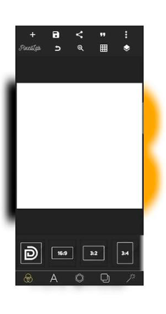
📐 Choose the Right Canvas Size
The canvas determines the shape and dimensions of your final design.
For example:
- 📱 Instagram-style posts: Use a square or portrait-friendly canvas depending on the content.
- 📲 Stories and vertical graphics: Choose a tall canvas designed for mobile screens.
- 🖥️ YouTube thumbnails: Use a wide landscape canvas.
- 🖼️ Posters: Choose dimensions based on where the poster will be displayed.
- 🏷️ Logos: Consider a square canvas when developing an initial concept.
Choosing the correct dimensions before designing can prevent unnecessary cropping later.
✍️ Customize Text in PixelLab
Typography is one of PixelLab’s strongest areas. A simple design can become much more attractive when the text is properly arranged.
Start by adding a text layer and entering your message.
You can then customize several properties.
🔤 Select a Suitable Font
Fonts influence the personality of a design.
A bold font may work well for a headline, while a simpler font can be better for supporting information.
When selecting fonts, consider:
- Readability: Make sure viewers can understand the text quickly.
- Style: Match the font with the subject and mood of the design.
- Weight: Use heavier fonts for important headings.
- Consistency: Avoid using too many unrelated fonts in one design.
A professional design often uses a limited number of font styles instead of filling the canvas with different typefaces.
📏 Adjust Text Size and Spacing
Text size creates visual hierarchy.
Your main headline should normally receive more attention than secondary information.
You can improve typography by adjusting:
- Font size
- Letter spacing
- Line spacing
- Text alignment
- Position
- Width and height
- Rotation
Experiment with these settings while keeping readability as the priority.
🌈 How to Create Better Text Effects
PixelLab provides several options for making text stand out.
Instead of adding every available effect, use effects that support the design.
🌟 Text Shadow
A shadow can separate text from a busy background.
For example, white text placed over a photograph may become difficult to read. A subtle dark shadow can improve contrast without making the design look overly complicated.
🖍️ Text Stroke
A stroke creates an outline around letters.
This can be useful when:
- The background has multiple colors.
- The text needs stronger contrast.
- You are creating a poster headline.
- You want a bold title effect.
Use a stroke carefully because an extremely thick outline can reduce readability.
🎨 Gradient Text
Gradient colors can give typography a modern appearance.
Try combining two related colors rather than using many unrelated shades. A smooth transition usually looks cleaner than a complicated combination.
💡 Glow Effects
Glow can be useful for creative posters, gaming graphics, technology-themed designs, and decorative typography.
However, excessive glow can make text difficult to read. Use it as an accent rather than applying it to every element.
🖼️ PixelLab Photo Editing Basics
PixelLab can also be used as part of a simple mobile photo-editing workflow.
Import an image into your project and use it as the foundation of your design.
You can then add:
- ✨ Text
- 🔷 Shapes
- 🖼️ Additional images
- 🌈 Color elements
- 🔲 Backgrounds
- 💫 Decorative effects
- 🏷️ Branding elements
The goal is to build the design in layers so individual elements can be adjusted without rebuilding the entire project.
🧱 Understanding Layers
Layers are essential when working on complex designs.
Think of every element as an individual piece.
For example:
- 🖼️ Background image
- 🌑 Overlay
- ✍️ Main headline
- 📝 Supporting text
- 🔷 Shapes
- 🏷️ Logo or branding
- ✨ Decorative elements
Keeping elements separated makes editing much easier.
If you place everything into one image too early, changing a single component can become difficult.
🎯 Create a Professional Poster
Creating posters is a great way to practice PixelLab.
Start with a clear objective.
Ask yourself:
What should the viewer notice first?
Once you know the answer, create a visual hierarchy.
Step 1: Select a Background
Choose a background that supports your subject.
A background should not compete with your main message.
Step 2: Add the Main Heading
Create a short and noticeable headline.
Avoid putting an entire paragraph into the main heading.
Step 3: Add Supporting Information
Place important details underneath the main headline.
Keep supporting text smaller so the viewer immediately understands the hierarchy.
Step 4: Add Visual Elements
Use shapes, icons, photos, or decorative elements where they improve the composition.
Step 5: Check Alignment
Look carefully at the spacing between elements.
A design can contain excellent colors and fonts but still look unprofessional if objects are randomly positioned.
Step 6: Review Before Exporting
Zoom out and look at the complete design.
Ask:
- Is the main message obvious?
- Is the text readable?
- Is anything unnecessarily large?
- Are the colors working together?
- Does the design feel balanced?
🎨 Understanding Color in PixelLab Designs
Color plays an important role in graphic design.
Instead of choosing colors randomly, create a small palette.
A simple palette can contain:
- 🎨 Primary color: The main visual color.
- ⚪ Secondary color: Supports the primary color.
- 🖤 Neutral color: Used for backgrounds or readable text.
- ✨ Accent color: Used to highlight important information.
Good color combinations can make a design easier to understand and more visually consistent.
🧠 PixelLab Typography Tips for Beginners
Typography is more than selecting a beautiful font.
Consider the relationship between every text element.
Keep Headings Clear
Your main heading should communicate the topic quickly.
Avoid Too Many Fonts
Using many fonts can make a design feel disconnected.
Two or three complementary font styles are often enough for a simple project.
Use Contrast
Contrast can come from:
- Font size
- Font weight
- Color
- Position
- Background
- Spacing
The goal is to guide the viewer’s eyes through the design.
📱 PixelLab Tutorials for Social Media Graphics
PixelLab can be useful for creating graphics for social platforms.
Some projects you can practice include:
- 📸 Instagram-style posts
- 📲 Story graphics
- ▶️ Video thumbnails
- 📢 Promotional announcements
- 💬 Quote graphics
- 🎉 Celebration posts
- 🛍️ Product promotional images
- 📚 Educational posts
For social media designs, remember that people often see the graphic for only a few seconds. Keep the primary message easy to recognize.
🖌️ How to Create a Simple Logo Concept
PixelLab can also help beginners experiment with basic logo concepts.
Start with a short brand name or abbreviation.
Then:
- Choose a readable font.
- Adjust the text size.
- Experiment with spacing.
- Add a simple shape if needed.
- Choose a limited color palette.
- Align the elements carefully.
- Export the concept and review it at different sizes.
For professional branding projects, you may eventually need more specialized vector design software, but PixelLab can be a useful starting point for experimenting with ideas.
🔥 Advanced PixelLab Techniques to Practice
Once you understand the basics, start experimenting with more advanced techniques.
3D Text Effects
Three-dimensional text can create depth by combining shadows, offsets, highlights, and color variations.
Use this style for posters, gaming graphics, promotional designs, and creative typography projects.
Double Exposure Effects
Double exposure combines visual elements to create an artistic composition.
You can experiment with a portrait and another image while controlling transparency and positioning.
Background Removal
Removing a background can help isolate a person, object, or product.
After isolating the subject, place it over a new background and adjust the composition.
Image Overlays
Overlays can add atmosphere and visual depth.
Try subtle textures, gradients, shapes, or transparent color layers instead of overwhelming the original image.
💡 Common PixelLab Design Mistakes
Learning what not to do is just as important as learning techniques.
❌ Using Too Many Effects
Applying shadows, glow, strokes, gradients, and 3D effects to every element can make a design difficult to read.
❌ Poor Text Contrast
If text blends into the background, viewers may struggle to understand the message.
❌ Too Many Fonts
Different fonts can compete for attention.
❌ Weak Alignment
Randomly positioned objects can make even a simple design look unfinished.
❌ Overcrowding
Do not fill every empty space.
White space can make important elements easier to notice.
❌ Ignoring Mobile Viewing
If your design will be viewed primarily on phones, check how small text appears on a mobile screen before publishing.
🚀 A Simple PixelLab Learning Plan
If you are new to PixelLab, do not try to master everything in one day.
Follow a simple progression.
Day 1–2: Basic Tools
Learn the canvas, text, image import, shapes, positioning, and export options.
Day 3–4: Typography
Practice fonts, text size, spacing, stroke, shadow, and alignment.
Day 5–6: Colors and Composition
Learn basic color combinations, contrast, spacing, and visual hierarchy.
Day 7: Create a Complete Poster
Combine everything you learned into one complete design.
Week 2: Advanced Projects
Practice thumbnails, social media graphics, logo concepts, invitations, photo manipulation, and creative typography.
The more projects you complete, the easier it becomes to understand which tools are actually useful.
📚 PixelLab Tutorial Ideas to Explore Next
After learning the fundamentals, you can continue with specialized projects such as:
- How to Create a Birthday Poster in PixelLab
- How to Make 3D Text Effects in PixelLab
- How to Design an Instagram Story in PixelLab
- How to Create a YouTube Thumbnail Using PixelLab
- How to Make a Professional Logo in PixelLab
- How to Create an Event Invitation
- How to Design a Book Cover in PixelLab
- How to Create Social Media Templates
- How to Make Creative Quote Graphics
- How to Edit Product Photos in PixelLab
- How to Create Typography Posters
- How to Design a Business Advertisement
- How to Create a Festival Greeting Card
- How to Make a Simple Photo Collage
These projects allow you to practice individual skills while building a broader understanding of mobile graphic design.
🏁 Conclusion
PixelLab can be a practical tool for learning the fundamentals of photo editing, typography, and graphic design on a mobile device. Its combination of text customization, image layers, shapes, colors, shadows, and creative effects gives beginners plenty of opportunities to practice.
The key is not to use every effect available. Instead, focus on clear typography, good composition, readable colors, balanced spacing, and purposeful design elements.
Start with simple projects, repeat the techniques you learn, and gradually move toward more advanced designs. With consistent practice, PixelLab can become a useful part of your mobile graphic design workflow.
❓ Frequently Asked Questions
Is PixelLab good for beginners?
Yes. Beginners can use PixelLab to practice basic typography, poster creation, image composition, and social media graphic design.
What can I create with PixelLab?
You can create posters, social media graphics, thumbnails, invitations, quote designs, typography graphics, simple logo concepts, and other image-based projects.
Can PixelLab be used for photo editing?
Yes. PixelLab can be used to combine photos with text, shapes, overlays, backgrounds, and other design elements.
How can I improve my PixelLab designs?
Focus on typography, alignment, color contrast, spacing, composition, and simplicity. Practicing complete projects is one of the best ways to improve.
Can PixelLab create 3D text?
You can create various 3D-style text effects by combining text, colors, shadows, offsets, and other visual effects.
Is PixelLab useful for social media design?
Yes. You can use it to create different types of social media graphics, including posts, stories, promotional graphics, quote images, and thumbnails.
How long does it take to learn PixelLab?
Basic tools can be learned relatively quickly, but developing strong graphic design skills takes continued practice. Start with simple designs and gradually increase the complexity of your projects.