


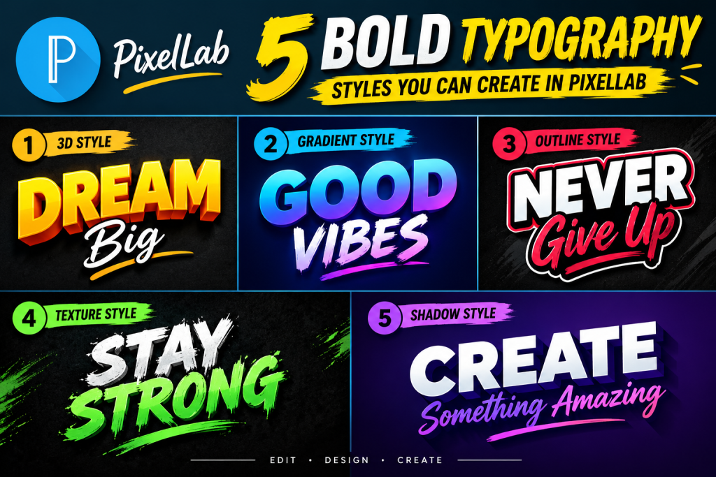
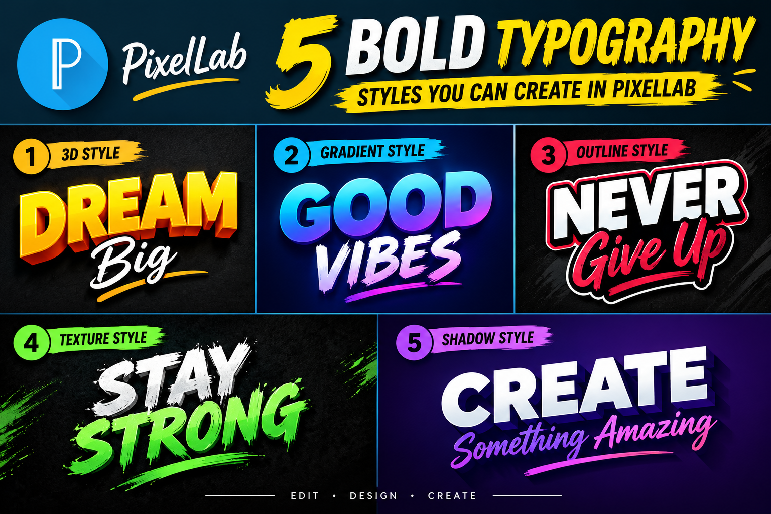
Scroll through Pinterest or Instagram these days and you’ll notice a pattern: Typography Styles Can you Create a PixelLab text isn’t just sitting quietly in the background anymore — it’s the main event. Oversized letters, curved layouts, and loud color combinations are dominating design feeds in 2026, and PixelLab happens to be a great tool for pulling off this look straight from your phone.
Here are five bold typography styles worth trying, along with how to build each one.

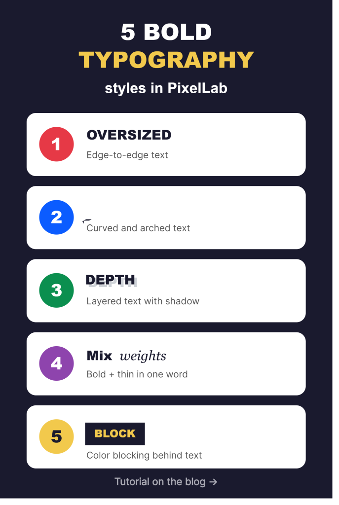
Table of Contents
1. Oversized, Edge-to-Edge Text

The simplest way to make a design feel bold is to let the text take up almost the entire canvas, with letters cropped right at the edges.
How to create it: Add your text layer, then scale it up until parts of the letters touch or slightly extend past the canvas edges. Choose a thick, heavy-weight font — thin fonts lose their impact at this scale. Pair it with a single flat background color for maximum contrast.
Best for: Pinterest pin titles, Instagram covers, bold quote graphics.
2. Curved and Arched Text
Straight horizontal text is reliable, but curved text instantly adds energy and movement to a design — a signature look in a lot of 2026 typography trends.
How to create it: After placing your text layer, look for the curve or arc adjustment in the text settings. Start with a subtle curve and increase it gradually; too much curve can hurt readability, especially for longer phrases. This works especially well for short, punchy headlines or single words.
Best for: Logos, badge-style designs, playful social posts.
3. Layered Text with Depth
Instead of flat, single-color text, try stacking multiple text layers slightly offset from each other to create a sense of depth — without going full 3D.
How to create it: Duplicate your text layer, shift the copy a few pixels behind the original, and change its color to a darker or contrasting shade. This creates a simple drop-shadow-like effect that reads as more dynamic than a flat single layer.
Best for: Headlines that need to stand out against busy photo backgrounds.
4. Mixed Font Weights in One Word
A trick a lot of bold typography designs use: combining a thin font and a bold font within the same word or phrase to create contrast and visual interest.
How to create it: Split your text into two separate layers — for example, the first syllable in a heavy bold font, the rest in a thin or script font. Align them carefully so they read as one cohesive word. This technique works best with short words of two or three syllables.
Best for: Brand names, logo concepts, editorial-style headlines.
5. Bold Color Blocking Behind Text
Sometimes the boldest move isn’t the font at all — it’s what’s behind it. Solid, high-contrast color blocks placed behind or around your text can make even a simple font feel loud and modern.
How to create it: Add a solid shape layer behind your text layer and fill it with a saturated, high-contrast color relative to your text (think black text on bright yellow, or white text on deep red). Keep the shape simple — a rectangle or rounded block works better than anything overly decorative.
Best for: Pinterest pins, promotional banners, sale graphics.
Quick Tips for Making Bold Typography Work
- Pick one bold move, not five. Combining an oversized font, a curve, layered depth, and color blocking all at once usually looks cluttered rather than bold. Choose one technique per design and commit to it.
- Contrast is everything. Whether it’s color, size, or weight, bold typography relies on clear contrast between elements to actually read as “bold” rather than just big.
- Keep text short. These styles work best with single words or short phrases — they tend to break down with long sentences.
Final Thoughts
Bold typography is having a real moment, and the good news is you don’t need professional design software to join in. PixelLab gives you enough control over fonts, layering, and color to pull off any of these five styles directly from your phone. Pick one, try it on your next graphic, and see how much of a difference strong typography alone can make.
Which style are you trying first? Let us know in the comments.
PixelLab 3D Designs in 7 Easy Steps Text Tutorial: Create Eye-Catching